September 2022: Email Inspiration
This month, we’ve got all the email inspiration. Our team Attended HubSpot INBOUND 2022 and got incredible knowledge bombs dropped on us by the energetic Jay Schwedelson. We did a newsletter round-up of the the most important takeaways we got from his talk, if you missed it scroll to the bottom of this post to get them.
Now, let’s dive into the best emails we’ve seen since…well…since last month.
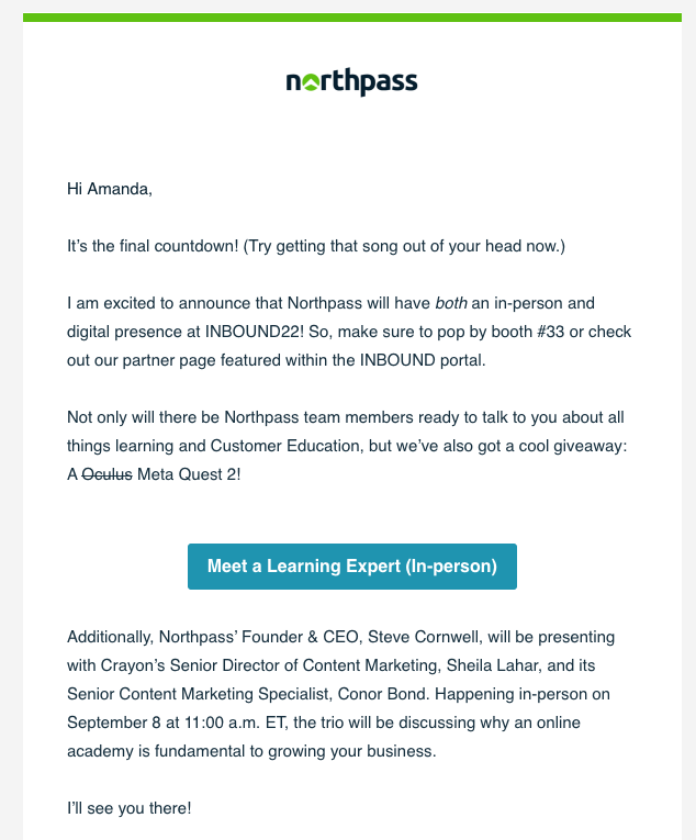
Email 1: It’s the final countdown
Why we like it: They kicked off with song lyrics and a little sense of humor. We were talking about it in the office (singing a little too if I’m being honest). They also sent a hyper-targeted email about HubSpot INBOUND, which we were all attending.
✅ Timely
✅ Memorable
✅ Personalized
✅ Got our team talking about their brand
Email 2: A Design That Guides the Eye
Why we like it: The curve of the bottom of the header image combined with the head extending past the orange box in this email guides the viewers eye to the call to action in the white space very effectively. Bonus points for the great use of white space around the CTA .
Email 3: Just…Wow
Why we like it: It’s hard to look away from this beautiful email. The colors—on point. The timely nature of a seasonal message—nailed it. The rustic look of the lined paper—we’re bowing down. Did I buy flowers I didn’t need to buy because of this ad? Why yes. Yes I did.
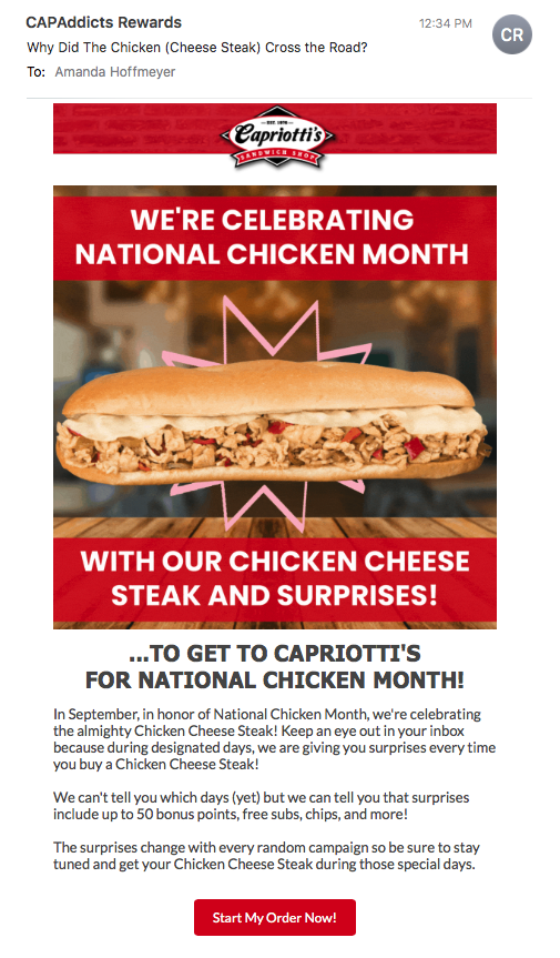
Email 4: Can’t Go Wrong with National Chicken Month
Why we like it: They did a great job of pulling one of those “awareness months” we talked about in our newsletter (if you missed it scroll down to read about this). The “Start My Order Now” CTA is compelling and you better bet I’ll be checking my email all month to find out what kind of surprises I can get for buying a cheesesteak.
🙌🙌🙌 Also that subject line. GOLD! 🙌🙌🙌
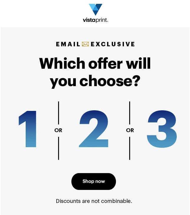
Email 5: Oh so Click-able
Why we like it: It’s simple, it’s compelling, it’s begging to be clicked. This email did a great job of leading the viewer to click out of pure curiosity. Many brands are employing strategies like this to get a better handle on engagement metrics since iOS 15 has made open rate a less meaningful metric.
Email 5: Gifs in email
Why we like it: The screenshot doesn’t do this one justice. In the original email the main image is a gif that shows the hoodie being customized in real-time. People love customizing their own gear and this email was begging to be clicked.
Join us next month for more email inspiration! And if you missed the long list of highlights from our September newsletter—read on!
From Our September Newsletter:
The long list of B2B email updates you can't afford to skip
We know...there's a lot here, but wow. So many knowledge bombs were dropped at Inbound that we had trouble narrowing the list down. We can't take credit for any of this. Email master Jay Schwedelson...wow, just wow...we are in full raving fan mode. He's incredible. But his insights were too awesome to keep to ourselves.
Spam Words: This isn't a thing anymore. If you're avoiding "free", or emojis, or any other supposed trigger words in your email subject lines and body copy, stop worrying. People love free stuff. Give the people what they want!
UGC: Add user generated content to your B2B emails. Click rates go up 32%.
Most Read: Curate most popular content for your users and give it subject lines that include "most read" or "most popular". We all want to engage with things other people liked.
Gifs in Email: Use them. They increase click through rates by 34%.
New Subscriber Email: Don't skip out on these! Data indicates that if people open your first email it increases the chances your future emails will be opened by 85%.
The Spam Folder: Will your emails end up there? Yep. Do you need to freak out? Nope. Was it because of spam words? Hey aren't you reading this?! Refer to the first knowledge bomb. They end up there often because of sending reputation. Focus on sharing good content and sending reputation.
Celebrate Good Times, Come on!: We want to celebrate anything and everything, don't miss out on important days.
Avoid Squirrels: Your landing pages should only have the ONE thing you want your prospect to do. No navigation, no social share, no nothing. We've talked about this one before in our newsletter and were stoked to hear Jay had the same suggestions. If you only have one offer on your landing page your conversion rate goes up 240%...the data doesn't lie!
Post-Registration Offers: When people sign up for something redirect them to an instant offer. The result? 13% higher CTR and probably some more SQLs.
Send Time: Over 80% of emails are sent on the hour. Yikes. Who wants to be in the inbox with that mess? Send your email 10 minutes after the hour and see a 17% increase in open rates.
Testimonials: Include testimonials near your CTA on landing pages. Why? Oh this little thing called a 27% increase in conversions.
Ehhhht, No On-Demand: Say watch now vs watch on-demand in webinar subject lines for a 34% increase in email open rates.
Emojis: Use them. If you want better email open rates use them as the first character in your subject line. Here's the 3 emojis that are performing best: ⏰ ⏳ ✔️
Tomorrow: Instead of saying the day of the week in your subject line "Webinar Saturday", say "Webinar Tomorrow" and get a 28% higher open rate.


